

NIKKI'S CHICKS: Eva Cordia

One day I had a transformative realization. I had just moved into a new apartment and was trying to ~decorate~ and buy furniture. I was looking at my Pinterest board to figure out how to translate my antique Italian nonna inspo to my Montreal apartment.
I realized that it would never fully feel the way I wanted it to because a few key elements were getting in the way:
1) Flooring. I don’t have terracotta/tile flooring. And my shade of wood is not right.
2) Ceiling height. Self-explanatory
3) Walls. I’m not going to paint frescos onto my walls or really put up any kind of wall covering because that’s too much work.
4) Built-ins. Shelving, fireplaces, moldings, etc.
And even down to sunlight and climate. I had to accept that I could try, but, I probably wouldn’t end up with the apartment of my dreams. I had to learn to work with the foundation I was given. If I didn’t, it would never feel right. It still doesn’t feel right but, I’ve given up on that endeavour because well… it’s just too much work. But that’s not the point of that story.
The point is, I had to spend time dissecting the images to understand what was achievable and not and why. The why is crucial. This applies to any kind of inspiration. To extract something requires deep meditative analysis. And, as I’m in this phase with my wardrobe where I’m trying to figure out why I’m never happy with my outfits, I decided to look back on some people I admire and attempt to pinpoint why/what it is that I like about what they’re doing.
Since the Picky Nikki inception, I have wanted to do a series called: Nikki’s Chicks. The concept was, in an Into the Gloss way, to interview girls I know IRL who don’t post enough thus gatekeeping their secrets from the world. I have yet to find a format for this so, drafts they shall remain. For now. But, I was scrolling through Instagram today and came across @evacordia. Now I don’t know her personally, but I’m launching this series as a profile on girls I think are interesting.
Eva is the founder of The New Studio. I don’t know much about her or her brand but, her vision is exactly what feels cool and right to me ATM. So let’s go through some of my favourite looks…
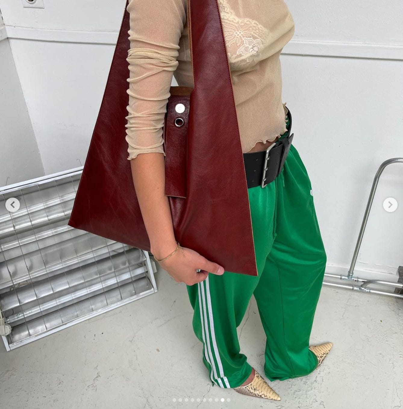
It seems like the New Studio sells vintage pieces alongside their line of handbags made in Italy from leftover leathers. At first glance, I wasn’t that struck by the bags but, going through her Instagram I’ve convinced myself I need one. My favourite, and evidently I’m not alone since they’re mostly all sold out, is the S01. A shoulder bag pictured below with a round carabiner keyring fastened onto the eyelet. I simply must have it 😍

This outfit below is so good. The tote version in a beautiful chestnutty red. Green Adidas track pants, which I still love, so clearly are not going out of style too soon. Snake print pointy pumps. Animal print still going. An oversized belt, which, I probably would not do but, the black here serves a purpose. Mesh top and vintage bra underneath which I believe is also from The New Studio.
The most obvious thing about this outfit is the colour pairing. The green has a childish feel which is why it feels most interesting paired with more subdued ‘adult’ colours like that shade of red and beige. The black belt anchors the outfit. A grey shoe would also look very good with this to add a cool-toned element and would help make the belt feel more intentional.
The mix of materials and textures is also very interesting. The bag has a worn look while the belt is more matte. The pants are elevated by a top that is sexy and girly and mature.

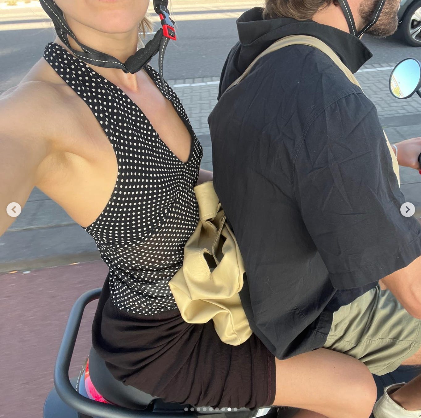
Polka dots are still on my list of things of to buy and this one is basically the exact top I want. The fit on her is impeccable. It’s perfect with that creamy bag. Polka dots are hard because it’s easy for them to feel like traditional officewear à la Tristan/Smartset/Reitmans. They have to be styled correctly in order to feel cool. The brown skirt is a perfect compliment here. I guess it’s because it breaks the traditional fashion rule of that era that black and brown don’t go.
This outfit would be really cute with a blue or red shoe. Or maybe something in that same Adidas green. I think a primary colour would avoid it feel too vintage and too earthy. If she put rust on top of this or burgundy or taupe it might just make it all feel blah. A primary colour would reinvigorate.
I’m just so obsessed with the keyring. This outfit is a little clean girl for me personally. But, the bag. So good. I would maybe prefer it with blue ripped grass-stained/sand-blasted jeans. Or with an oversized vintage logo tee to make it feel more like sloppy, she was running out of the house.

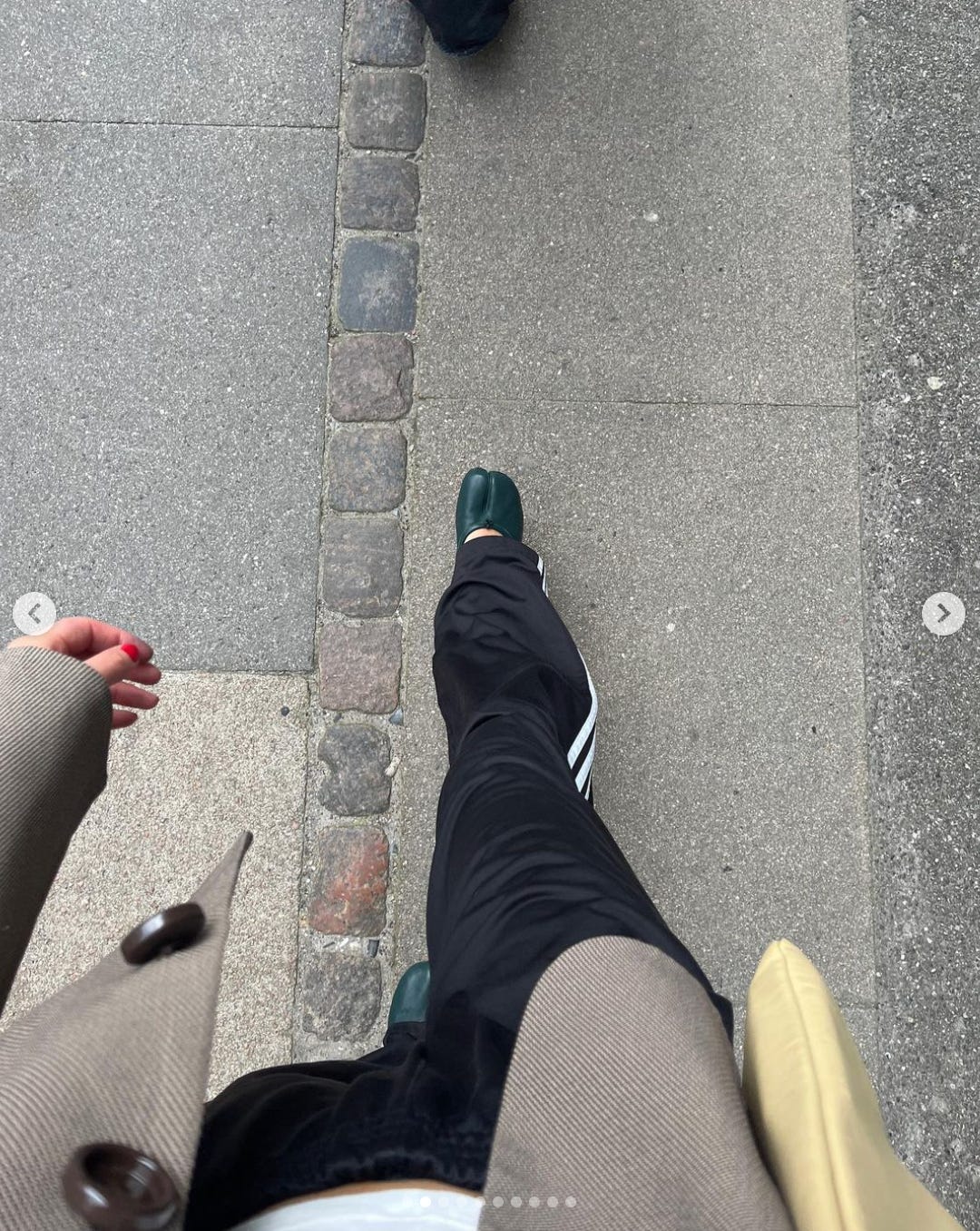
I had a pair of Margiela tabis in a denim-y blue colour that I sold last year because I felt like the colour wasn’t right for me. Then I saw this outfit and realized I was being uninventive with my colour pairings. That blue would have gone really well with this outfit too. But this shade of teal was not onLY*
my signature MSN font colour but, is one of those colours that I gravitate towards. I don’t own anything in this colour but Eva is really making a case for colours in general. The green and the cream go best together. Her red nails add interest. Then the brown coat with dark brown buttons and black pants with white tee make it all cohesive in a perfect way.
Here too, is less about textures and more about pairing formality levels together. Track pants with a more structured and office-appropriate jacket. The shoes have a ballet nod that contrasts the soccer pant. The bag adds a coolness with it’s undressed and casual shape.
I’m literally such a stan.
I’m guessing this is the same jacket. It’s so good. I love it paired with the patent burgundy bag though that shape isn’t my favourite.
I also have been trying to make a case for black tees. The culture right now is still so obsessed with white tees. Which are fine and useful but like, I think that aesthetic of jeans and a white tee is honestly kinda tired and doesn’t look as classic and vintage as it used to. Black tees are chic. They’re a bit more evening. They create a colour palette with the brown that white would ruin and turn into something more… boring and daytime and bright.

First of all, I love red. Second of all, I love a vintage tee. Somehow I feel like every vintage tee on me just looks like pajamas. There are 3 reasons for this: 1) my vintage tee graphics are cool enough 2) My shoulders are not broad enough to carry most t-shirt cuts and 3) I’m not flat chested enough for it to have an effortless feel.
My vintage/graphic tee issue aside, the red with cream is phenom. I’m assuming the pants are navy, those colours are just mwah. I don’t love the belt myself but, the shape created is cute.

Ok here we have more sportswear. Blue shorts with yellow stripes, red pumps. I basically could recreate this entire look. Except of course I don’t have the bag which I think brings the primary tones together. Earth tones and primary colours are literally meant to be.

Well there you have, my analysis of Eva Cordia’s style. My current obsession. Her homeware aesthetic is also, getting into my brain. I’m currently pondering whether it looks weird or cute for me to tranform my bedroom to have this aesthetic since I have most of the trappings for it. But again, somehow when I take all the junk off my dresser it just feels empty and awkward instead of cool and simple.

Please weigh in if you have your own thoughts… I’m fascinated by this